Now, I fully concede that what I’m about to write about might be a hoax. If so — well played, sir! — at least I can take comfort that I and billions of other people have fallen for this hoax, too.
The more I read, the more sense the argument made — that all those years spent staring at maps on the wall in school could have prioritized capitalism over historical accuracies.
And like all controversial news items, this one was started with a post on Facebook.
The Facebook post that pricked my curiosity was from Upworthy that states that we have been misled about the shape and look of our own planet for more than 500 years (coincidentally, the same amount of time as the colonization of Northern and Southern America by European powers. That said, I have also heard people cry foul as to why the Canadian landmass appears so small in contrast to the United States — people also cry foul that Canada appears on maps in the colour pink, supposedly to reflect our embarrassment of being seen next to the U.S.).
In the minds of colonialists — and this thinking trickles down to the European and American masses — bigger means better. Better as in more superior. Therefore, we’ve all sat in school and stared at maps which we are now being told are grossly deformed and inaccurate when it comes to its neutral and scientific depiction of certain continents and countries.
For example, the size of Europe is greatly engorged and enlarged. The continent of Africa, on the other hand, has been grossly distorted to appear much smaller a land mass than it really is.

Sure, perhaps some of the creative lee-way here can be attributed to the lack of technology of cartography, but now we have satellites and space stations — yay, technology! — that should give us a visual to correct our mistakes.
The origin of this map
The origin of this inaccurate “Mercator Map” was in 1596 with the priorities of shipping, commerce and world domination in mind.
According to the Internet oracle Wikipedia, “While the linear scale is equal in all directions around any point, thus preserving the angles and the shapes of small objects (which makes the projection conformal), the Mercator projection distorts the size and shape of large objects, as the scale increases from the Equator to the poles, where it becomes infinite.”
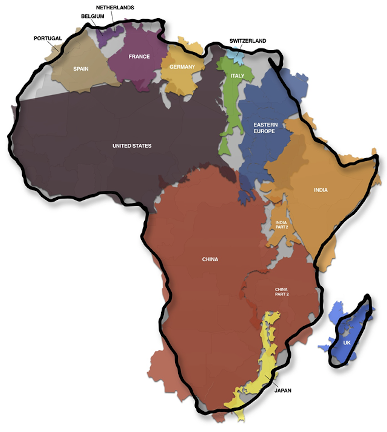
On maps, one of the first things noticeable are the size of continent compared to one another. Or certain countries compared to others. And, of course, there is the fact that Greenland seems to loom over the entire world in a Godzilla-like massiveness that threatens to crush the rest of the Americas under its snowy weight
So it goes: North America is larger than Africa. Alaska is larger than Mexico. China is smaller than Greenland.
But in reality China is four times bigger than Greenland, Africa is three times bigger than North America and Mexico is larger than Alaska.
Now while some of these distortions are technical in nature, others reflect the ideological assumptions about geography and assumed racial superiority (if we, for a moment, suspend the notion that race doesn’t exist).
Mercator maps display the correct shape of continents and other large land-mass nations but it does so at the expense of distorting size.
According to according to James Wan writing in The Guardian, the distorting of size most often occurred to favour wealthy Global North nations. “The familiar Mercator projection gives the right shapes of land masses, but at the cost of distorting their sizes in favour of the wealthy lands to the north”
For instance, in the Mercator projection, North America looks at least as big, if not slightly larger, than Africa. And Greenland also looks of comparable size.
But in reality Africa is larger than both. In fact, “you can fit North America into Africa and still have space for India, Argentina, Tunisia and some left over,” notes Mr. Wan of Think Africa Press.
Google Earth gets billions of hits on the Internet and struggles to keep up its “never-ending quest for the perfect map” in a 2014 interview with The Guardian.
To present some of the errors in the Mercator Map — named after the capitalist Mercantile System of global trade that brought us slavery:
- Africa is around 14 times larger than Greenland and yet on the map both are almost same size.
- Brazil is more than five times larger than Alaska, yet Alaska is larger than Brazil on the map.
- The map suggests that Scandinavian countries are larger than India, whereas in reality India is three times the size of all Scandinavian countries put together.
- While it looks like Europe is larger than North America on this map, in reality the reverse is true. Russia also isn’t as large as it is depicted, with Africa larger than Russia in reality.
The correction of this distortion is possible through Tissot’s indicatrix, created by Nicolas Tissot in 1881.
Another is the Gall–Peters projection, created in 1855 by clergyman James Gall.
“The history of the Mercator projection and the north-is-up convention show how small cartographic decisions can make huge differences in how we see the world. The decisions made by Google’s engineers may have similarly significant repercussions, although they may operate in more subtle ways than, for example, deciding which way North should point,” says Wan.
Support rabble today!
We’re so glad you stopped by! Thanks for consuming rabble content this year.
rabble.ca is 100% reader and donor funded, so as an avid reader of our content, we hope you will consider gifting rabble with a donation during our summer fundraiser today.
Whether it be a one-time donation or a small monthly contribution, your support is critical to keep rabble writers producing the work you’ve come to rely on as a part of a healthy media diet.
Whether it be a one-time donation or a small monthly contribution, your support is critical to keep rabble writers producing the work you’ve come to rely on as a part of a healthy media diet.
Become a rabble rouser — donate to rabble.ca today.
Nick Seebruch, editor