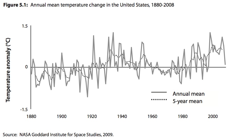
Some colleagues at the U.S. NGO Global Exchange tipped me off to some sneaky data doctoring done by the Fraser Institute on climate change. The source is Understanding Climate Change: Lesson Plans for the Classroom, a resource for high school teachers. The particular graph is on page 69 (first page if you click on Lesson 5), attributed to NASA’s Goddard Institute for Space Studies.
The text comments only that “The graph illustrates that temperatures have risen over time, except during a cooling period between 1940 and 1970 (a period during which CO2 levels rose rapidly).” Later, the lesson plans prompts teachers to “ask students to draw conclusions from the data using positive analysis” and provides a full-page version that can be printed and handed out to a class. Several other graphs are presented with varying time horizons, each carefully presented to sow doubt about climate change while appearing to be objective and scientific.
But here is the exercise students should be asked: compare the Fraser’s version of the graph with the original from the NASA Goddard Institute. In the original version, five-year means are emphasized as a way of smoothing out the larger fluctuations in annual data. In the Fraser version it is the reverse: by emphasizing annual data and downplaying the five-year means it looks more random, as if there has been little warming at all. Ironically, the intro to the Fraser lesson states: “Students will learn that data can be misused, whether by a selective use of data subsets or by graphing and charting tricks.”

But the Fraser Institute is also guilty of omission. It’s global warming we are talking about not American warming (although 2012 did top the charts as hottest year on record, highlighted by Hurricane Sandy and massive drought). Here is global data from the same source, which was passed over by the Fraser’s lesson plan:

The Fraser’s lesson plans show a few other graphs over longer time horizons that infer warming is normal and probably not caused by humans. In fact, there is scientific consensus on precisely the opposite. Why any teacher would use these materials in their classroom is beyond me, when there are many other lesson plans from credible institutions. But it also shows some of the secrets of the Fraser Institute’s success: they publish materials that sound scientific and well-reasoned when they are actually fronting for corporate interests who profit from sowing confusion among the public.


