In June of this year over 4,000 daily high temperature records were broken in the United States. There were 159 record high temperatures for the month, and 42 all-time temperature highs. July has been even worse, the hottest month ever recorded in the United States since comprehensive weather recording began in 1895. July 2012 was the 328th consecutive month that global temperature exceeded the 20th century average. In Canada record-setting temperatures were recorded in July in many parts of the country.
In August there have been snowfalls throughout every district of South Africa, an unheard of event. Johannesburg has only recorded snowfalls on 22 days in the last 103 years. The great drought of 2010 in Russia caused massive wildfires that destroyed 25 million acres of crops. In 2010 China recorded its second highest temperatures ever, and India recorded its hottest year on record.
Is there a pattern here?
The weather is not the climate. Weather happens all the time, everywhere all around us. Hot days, cold days, rain, sunny weather, hailstorms, tornados, ice storms, snowfalls, hurricanes … everyone’s experienced at least a subset of the above. It changes day to day, hour by hour, sometimes even faster than that. Weather is what is happening now. Climate, on the other hand, is the season-by-season synthesis of weather patterns over a longer period and wider area. We experience weather moment by moment, but our individual understanding of climate is shaped from knowledge of atmospheric conditions over the long term. Nevertheless, despite the more intangible nature of climate, we all have a very tangible sense of what it is. Everyone knows the differences between a tropical, desert, Mediterranean, and tundra climate.
Is there a way we can determine if the extreme weather events we have been witnessing are indicative of a changing climate, or are we simply witnessing variable weather? The answer is yes.
Perception of climate change
James Hansen of NASA’s Goddard Institute of Space Studies, one of the foremost climatologists in the world, and his colleagues Makiko Sato and Reto Ruedy have provided an emphatic demonstration of how climate is changing. In a strikingly elegant publication entitled Perception of climate change that utilizes a colossal dataset of temperature measurements from throughout the globe gathered over the last sixty years, they clearly demonstrate that the kind of extreme weather patterns that are affecting the globe are consistent with, and illustrative of, how the climate has been changing over the last several decades. We’re going to see a lot more of such weather – and worse.
While demonstrating this scientifically involves some number crunching and statistical sophistication, the overall approach is easy to understand and puts to rest any lingering doubts about the reality of climate change that anyone might have harboured. In their analyses, Hansen and his colleagues established a reference period of 1951-1980. During this time the climate was stable and similar to the climatic regimen during the entire Holocene (i.e., the last 12,000 years). Moreover, it is also recent enough that people of the baby boom and older generations actually remember what the climate was like back then. They then compared this “base” period to what has happened between 1981-2011. What did they find? A great deal, but before we go there, there’s one mathematical concept we need to clarify — standard deviation.
Standard deviation
We all know that weather varies. Not only does it change on a seasonal basis, but it also varies from day to day. Some days a little warmer or cooler, rainier or dryer, the barometric pressure changes, the relative humidity rises or falls. However, at each time of year it tends to change within what is normally a narrowly defined range. So, for instance, in mid-summer, if the average (or mean) temperature in your area is, say, +18ºC, days when it gets up to + 24ºC or only to +12ºC are not that unusual. Temperatures of -4ºC or +40ºC would be extremely unusual. The standard deviation (in mathematics represented by the Greek letter sigma) shows the distribution of values around that mean.
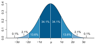
Most people are familiar with the “bell-curve” (or normal distribution) which represents the distribution of values around a mean. The rule is that 68.27 per cent of values lie within one standard deviation unit of the mean (half on either side); 95.45 per cent lie within two standard deviation units; and 99.73 per cent (i.e., almost all) lie within three standard deviation units. The name “bell-curve” represents the shape of this distribution, and the fact that under normal circumstances the bell is symmetrical, i.e., it tails off in the same way on both sides. So, in normal circumstances if there is a variability in temperature, it is as apt to be cooler as it is warmer
The temperature anomaly
So, with the math out of the way, let’s examine at what Hansen found. The graphs below show the summer (June-July-August) temperature anomaly in 1955, 1965, and 1975 (three representative years from the 1950-1981 reference period) compared with 2006-2011 (the most recent years). The “anomaly” is the difference between the mean temperature of the 1951-1980 base period, and what actually happened that summer. The colour represents the temperature anomaly; the darker the red, the warmer it was; the deeper the blue, the cooler it was. The small numbers at the upper right of each graph are the global mean for that year, that is to say the average over the entire planet.
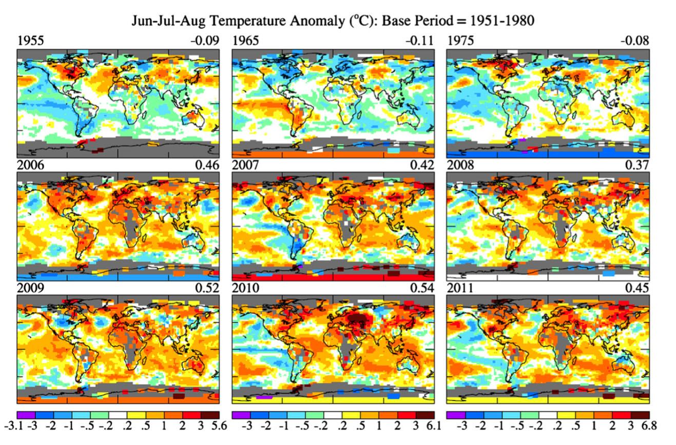
We can see that in 1955, 1965, and 1975 temperatures throughout most of the globe were normal and the global mean anomaly was small: -0.09, -0.11, and -0.08 ºC. The situation between 2006-2011 is completely different. The maps are dominated by orange, red, and brown (temperature anomalies from +1.0 ºC to as high as +6.8 ºC) with very little green or blue. In other words, most of the planet was experiencing warmer than normal temperatures and very little was experiencing cooler than normal ones. Indeed the global means (+0.46, +0.42, +0.37, +0.52, +0.54, +0.45) are more than five-times the values in the earlier period, and they are all warmer.
The extent and scale of these temperature anomalies and the clear difference between the 1950-1981 reference period and recent years, is a strong indication that something may be rotten in the state of Denmark. However, this information by itself isn’t enough. So, it’s been warmer in the last three decades than it has been during the previous three. So what? The weather varies all the time; even the climate naturally varies to very small degree. There are periods of cooling and of warming. Could we be witnessing this? How pronounced is this heating? This is where standard deviation comes in.
The standard deviation anomaly
The maps below show the same areas, the same years, and the same time period as above. However, this time the colour doesn’t indicate the temperature anomaly, but rather the anomaly in standard deviation (sd) units. The numbers above each map are the percentage of the area of each of the categories in the colour bar (± 0.0-0.43 sd, ± 0.43-2.0 sd; ± 2.0-3.0 sd; ± >3.0 sd — we’ll get to why 0.43 is the first number rather than 1.0 in a moment). This might sound arcane and mathematical, but stay with me.
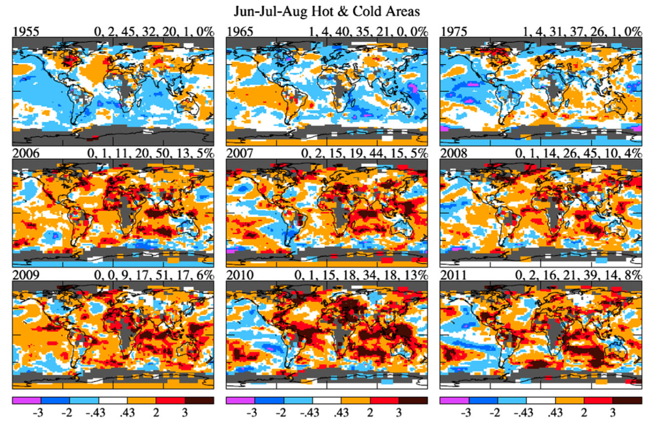
What do we see? In 1955, 1965, and 1975 there are substantial areas of white (±0.43 sd) and most of the rest of the world is either light blue or yellow (± 2.0 sd). From the bell-curve distribution, we know that 95.45 per cent of all values fall within two standard deviation units, so this looks normal. In 2006-2011 the situation is very different. We see much less blue (i.e., cooler areas), large areas of red (+ 2.0-3.0 sd), and substantial areas of brown (>3.0 sd). Indeed, the red category which comprised only 1, 0, and 1 percent of the planet in 1955, 1965, and 1975, now comprises 13, 15, 10, 17, 18, and 14 per cent in the years between 2006-2011. The brown category (more than three standard deviation units), which was completely absent in 1955, 1965, and 1975, now comprises 5, 5 ,4, 6, 13, and 8 per cent in the years between 2006-2011 — a dramatic increase. Again, going back to the bell-curve, in a normal distribution only 0.27 per cent of the land area should be hotter than three standard deviation units from the mean. However, between 2006-2011 an average of 6.83 per cent of the planet’s surface was that much hotter — an area over twenty-five times greater than should normally be the case. Now, this smells really rotten, and not just in Denmark, but all over the world. The emergence of this category of extremely hot summers is a new, and troubling, phenomenon.
Below is another way of looking at some of this information. These are the temperature anomalies (cold, very cold, extremely cold; hot, very hot, extremely hot — as above, in relation to the normal mean temperature for the areas) over land areas (i.e., not over the oceans) in the Northern Hemisphere (NH) summer (top row) and winter (second row), and Southern Hemisphere (SH) summer (third row) from 1950 to 2011. The graphs show what proportion of the land areas were covered by temperatures in each of these categories. What do we see? In northern and southern hemispheres in winter and summer, areas of very cold (dark blue) and extremely cold (violet) are very low for the entire time period (the left series of graphs). There are occasional increases of very cold areas to 10 per cent for a year or two. Cold areas (light blue), while very variable in extent from year to year, hover mostly around 33 per cent (the dotted line) from 1950-1981, and thereafter begin to decline to approximately half that amount of land area by around 2000.
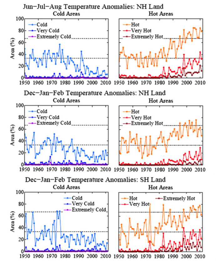
In terms of hot anomalies (the right set of graphs), very hot (dark red) and extremely hot (brown) areas in both hemispheres and both seasons are almost non-existent between 1950-1981. Thereafter they begin to increased markedly to encompass 25 to 35 per cent of the land area by the year 2000. Hot areas (orange), while very variable in extent from year to year, hover mostly around 40 per cent between 1950-1981, and thereafter begin to increase, reaching approximately 66 per cent (the second dotted line) by 2000. These are very dramatic changes in the world’s temperature regimen.
The loaded dice
 Imagine for a moment that we have a die (one of a pair of dice) coloured as follows: two sides white for normal temperature, two sides blue for colder than normal, and two sides red for hotter than normal. The area of the bell-curve between -0.43 to +0.43 standard deviation units encompasses a third of the entire distribution (the reason for the ±0.43 category in the above graphs). In a normal climatic situation, if we were rolling the dice to determine if the temperature (for a day, a month, a season, or any time period) was normal, colder, or hotter than normal, you would expect to roll a white face a third of the time, a blue face a third of the time, and a red face a third of the time. If you kept rolling the die and it kept coming up red over and over, and almost never blue, you would soon reach the conclusion that something was wrong — the dice were loaded.
That’s precisely what James Hansen and his colleagues have determined. Hot summers (i.e., those in which the seasonal mean temperature is greater than 0.43 sd units from the normal mean) are now being rolled 67 per cent of the time rather than a third of the time. Cold summers, on the other hand, are down to approximately 10 per cent rather than a third. The dice are loaded. The bell-curve is no longer symmetrical, but has been squashed and pushed towards the higher temperature end of the spectrum.
[Note: the change in winter is not quite as extreme because of higher variability in winter temperatures. Winter temperature varies more widely than does summer because the latitudinal differences between temperature in the winter hemisphere are greater from polar to tropical regions. So the temperature at any given latitude varies depending on whether the wind is blowing from the north or south.]
The loaded gun
 The loaded dice mean that humanity has a loaded climatic gun pointed to its collective temple. Anyone who was alive and paying attention before 1981 can perceive the difference in climate that has occurred subsequently, and the analysis of huge datasets of environmental information clearly and unequivocally confirm this change. The emergence of a new category of extremely hot summers over ever larger areas of the earth’s land surface (from 0.27 between 1950-1981 to 6.83 percent now — a twenty-five fold increase) is a dangerous and troubling phenomenon. It makes it clear that the extreme weather (heat, wildfires, droughts, floods, tornados, hail storms, hurricanes) that has been afflicting the world over the last several years is not a fluke — it is the new norm caused by climate change.
In nationwide polls in the United States conducted by the University of Texas in July 2012 the proportion of people who believed in the reality of climate change climbed to 70 per cent from 65 per cent in March, 2012 and the proportion of disbelievers fell from 22 per cent to 15 per cent. This confirms Hansen, Sato, and Ruedy’s observation that “… public opinion about the existence and importance of global warming depends strongly on their perceptions of recent local climate variations.” Despite this, climate change remains off the political radar in the 2012 United States presidential election.
In Canada belief in the reality of climate change is even stronger. Polling conducted last year by the Public Policy Forum and Sustainable Prosperity found that:
- 80 per cent of Canadians believe there is solid evidence of global warming;
- 91 per cent of this group believe it is a serious problem;
- 73 per cent per cent of Canadians indicated a willingness to pay at least $50 per year in extra energy costs for more renewable energy to be produced.
Despite that, climate change policy in Canada is a hollow shell of bogus goals, phony targets, unrealized promises, blatant disassembling, and a lack of tangible action.
The environmental audit released in May, 2012 by Canadian federal environment and sustainable development commissioner, Scott Vaughan, is a damning indictment of the Harper Government’s policies and practices. The absurdly low and inadequate greenhouse gas (GHG) reduction targets of 17 per cent below 2005 levels by 2020 (compared with the Kyoto Protocol targets which mandated 6 percent reductions below 1990 levels) will not be met. The government’s own documents estimate that GHG levels will be 7.4 percent above 2005 levels with existing policies — and those policies are incomplete themselves. There is a lack of critical cost-effective analyses, and regulations for key areas such as the oil and gas sector, are completely lacking. Commissioner Vaughn’s assessment that the Canadian government is “unlikely” to be able to meet its own climate-change goals is a charitable interpretation at best.
The loaded gun of climate change isn’t even a game of Russian Roulette. All six chambers are loaded and yet governments like Canada and the United States are still squeezing the trigger.
Christopher Majka is an ecologist, environmentalist, policy analyst, and writer. He is the director of Natural History Resources and Democracy: Vox Populi.

