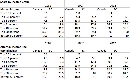
It’s an interesting finding, and perhaps the start of a good trend: the share of income going to Canada’s top 1 per cent has declined (Statscan release here, Globe story here). One great thing Statscan has done in recent years is to make its data freely available, so I went to dig deeper on national, B.C. and Vancouver trends (some more wonky notes on data are at the bottom).
What are some key takeaways?
B.C. and Canada have a remarkably similar income distribution, and that has persisted over time. It’s surprising that a province so far away from the economic centre of Canada could mirror so well national trends, but there you go.
Top 1 per cent shares surged between 1982 and 2006/2007. If you look at annual data, the growing share of the top 1 per cent is fairly slow and steady over that time period, peaking at the top of the business cycle then dropping back before recovering. Some 60 per cent of the market income of the top 1 per cent is from wages and salaries.
The top tenth of 1 per cent more than doubles their share of income between 1982 and 2007. For the top hundredth of 1 per cent, data are only available for Canada (although given the similarity in distribution, we can assume B.C. is comparable). The top 0.01 per cent share triples by 2006, at 1.9 per cent, compared to 0.6 per cent in 1982.
The share of the pie for these top income groups falls between 2007 and 2012, but they are still taking a much larger share of than they did in 1982.
The market income share of the bottom half of the distribution drops over the entire period. Looking at the annual data, its share bottoms out in 2010 at 9.8 per cent. Taxes and transfers make a big difference, nearly doubling the share of income for the bottom 50 per cent. Transfers are also the most likely explanation why the share of income after tax is only somewhat lower in 2012 than in 1982 (B.C. fares notably worse on this one).
The flip side of this is that the top 1 per cent get more of the income pie but also pay a bigger share of taxes (10 per cent of income, 19 per cent of income taxes).
If I pull the same data for Vancouver, inequality and trends over time are worse. The top 1 per cent got 11.2 per cent in 2012, compared to 9.5 per cent for B.C.; and the bottom 50 per cent got 16.6 per cent, compared to 18.4 per cent for B.C. as a whole. This makes sense given the high-income professional occupations in the big city.
The cut-off for making B.C.’s top 1 per cent (market income) in 2012 was $213,800; for the top 0.1 per cent, $694,200; and for the top 0.01 per cent, a cool $2.6 million.
A few comments on this data:
I look at two key income concepts: market income (not including capital gains, and before any taxes and transfers) and after-tax income (including capital gains, after transfers and taxes). The key difference is that the latter includes actions by government, and is a better indicator of actual inequality. Data go back to 1982 and end in 2012. Between those years inequality grows up to 2007, then shrinks somewhat, so I have added a peak year comparator of 2007.
An important note that these data are for tax filers — that is, individual income, not families or household income. I prefer the latter because with individual data you get a lot of students, retirees, and spouses (working part time or not at all) lumped into the bottom in a way that does not necessarily show their true command over resources.
Finally, you can thank the pioneering work of Thomas Piketty and Emmanuel Saez (and Michael Veall in Canada) for publishing research using tax data and highlighting adverse trends at the top of the distribution. Nice to see Statscan take up publishing this data. When I started at CCPA, one could only regularly get data for income groups in quintiles (groupings of 20 per cent) and sometimes for deciles (10 per cent groupings). So to be able to get a more accurate picture further up the income ladder, where we get the real action, is a gift to an economist.
You can create your own custom queries here.


