As any good reporter knows, drama drubs data. You want to convince someone of something, sell someone something or compel someone to action? A great story beats a spreadsheet, every time.
This is a lesson all journalists learn early and many scientists have trouble getting into their large craniums. Unless you can make your audience engage with a story, all your numbers are just like the muted trombone sounds in a Charlie Brown special when the teacher is talking. Waah, waah, waah.
You think Jenny McCarthy has a following because she knows how to use Excel?
Stories about income tax almost always start with an anecdotal lead: “Josh and Anita Roseman are going to have a little more to save for their daughter’s university education this year …” and Ms. McCarthy can spout rubbish about her son, autism and vaccinations and all the data becomes so much number gumbo.
But, telling a human story isn’t the only way to bring integers to life.
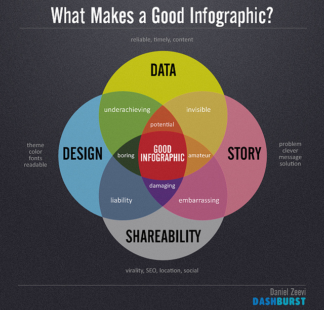
Good infographics can serve to illustrate a narrative hidden in data. Using carefully selected data points, charts, text and typography, they can brighten dull numbers and bring clarity to buried insights and patterns. They tell a compelling story with pictures. The best don’t dumb down data, they focus it. Besides, really, nothing is dumb as presenting a mass of grey numbers and expecting anyone to care.
Human-interest stories and great infographics are old tools in a communicator’s utility belt.
But, there’s a new kid in town. Interactive infographics.
Software tools like Qlik and Tableau make it possible for organizations to take reams of data and turn them into pie charts, scatter graphs and maps that you can publish to the Web or even embed on your own site. The magic of these new tools is that these infographics allow your users to play with the data themselves. You could, for example, publish an infographic that shows major pollution sources across Canada. But then your users, by just highlighting certain segments of the charts, zoom in on a province, or if you had the data to support it, their own city. Or you could publish epidemiological data and then users could drill down on just, say, women aged 19-34 in Alberta and all the pie charts, bar graphs etc. would change in response to that specific data set.
Both Qlik and Tableau offer free software trials, and both are relatively easy to use. Qlik is more powerful if you are looking to unpack relationships between multiple data sets. Tableau, however, is much easier to use if you want to get quick interactive graphics up online.
What this means, in terms of storytelling, is that users can find their own drama in the data, discover stories hidden in the numbers or even identify outliers that might have new stories to tell. “Why are so few women in Nova Scotia getting HPV vaccinations?” for example.
Since we are in the midst of a Big Data sea, these kinds of tools, that allow the visual display of quantitative information, will be an asset to organizations, activists and media outlets who want to crowdsource the discovery of the narratives in the numbers.
As with all tools like this, there may be some blowback within your organization from the folks who are the keepers of the data, and/or who see their ownership as a base of power. In the end, I don’t think they’ll be a real barrier. Like any kind of shift to crowdsourcing (folksonomic tagging, user-suggested stories, comments, shared document analysis), this is an unstoppable force that will soon be the way much data is presented online.
The sooner you learn the tool the sooner you can let your audience discover their own drama in what used to be the drab data that, it turns out, cleans up real nice.
Listen to an audio version of this column, read by the author, here.
Wayne MacPhail has been a print and online journalist for 25 years, and is a long-time writer for rabble.ca on technology and the Internet.
Image: Daniel Zeevi/flickr


